Football Design
92 Serbian Football Badges Ranked
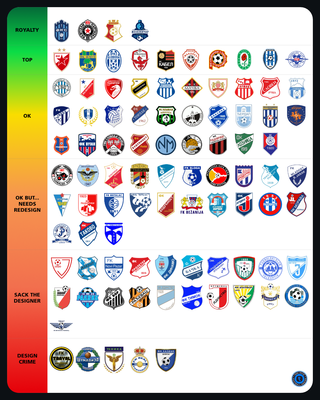
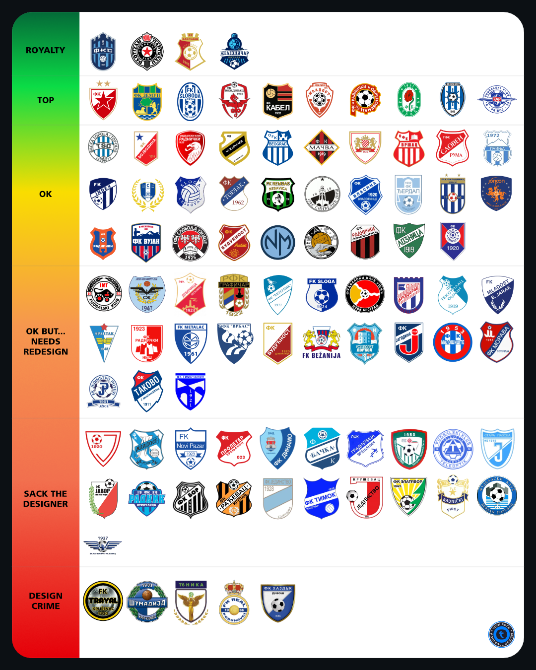
Football badges are strange pieces of design. They are logos, but supporters rarely treat them like logos. They are worn on shirts, painted on walls, stitched into flags and passed from one generation to another. Changing a line, a colour or a symbol can sometimes feel less like a redesign and more like rewriting part of a club’s history. That was the starting point for this project. I collected the badges of all 92 clubs competing across the first, second and third tiers of Serbian football and ranked them from a graphic design perspective. The result was deliberately subjective, but the reasoning behind it was not random. Rather than asking only, “Do I like this badge?”, I wanted to ask a more useful question: What actually makes a football crest good?
- Client
- Personal
- Services
The challenge
Serbian football has an enormous range of visual identities. At one end are nationally recognised clubs whose badges have been repeated for decades across shirts, stadiums, television and supporter culture. At the other are smaller regional clubs whose identities might have evolved gradually, sometimes without ever going through a formal branding process. That produces almost everything you can imagine. Traditional heraldic shields. Circular badges. Municipal symbols. Football illustrations. Monograms. Stars. Animals. Factories. Dates. Landmarks. Five different outlines around the same badge. Sometimes all at once. The challenge was therefore not to judge every club according to one visual style. A minimalist badge is not automatically better than a complicated one. An old badge is not automatically outdated. And a modern badge is not automatically good. Instead, each crest needed to be considered as a piece of football identity.
The solution
I used a set of basic graphic design principles to create a more consistent way of looking at each badge. Composition Does the badge feel balanced? A good crest should have a clear visual structure. The eye should know where to look first and the elements should feel like they belong together. Distinctiveness Could this badge belong to another club? Football is full of shields, footballs, stars and stripes. The strongest badges use those familiar ingredients in a way that becomes unmistakably their own. Scalability A football crest has to work everywhere. On the front of a stadium it may appear several metres tall. On a social media graphic or league table it may be smaller than a thumbnail. If the identity disappears when the badge becomes small, there is a problem. Visual hierarchy Not every element should demand the same amount of attention. Club name, symbol, founding year, football, landmark and decorative elements cannot all be the hero. Something has to lead. Colour Strong football identities often own their colours. The best badges use colour deliberately rather than simply filling every available space. Typography Many football badges contain lettering, but typography is often one of the weakest elements. Poor spacing, distorted type, unnecessary effects or too many typefaces can quickly make an otherwise solid crest feel amateur. Symbolism A badge should say something about the club. That might come from the city, a historical symbol, a nickname, an industry, a landmark or a piece of supporter culture. The important thing is that the symbolism feels specific rather than decorative. Longevity Football identity should not chase every design trend. A strong crest should feel believable today without looking obviously tied to one particular era of graphic design. I divided the 92 badges into six groups. Royalty was reserved for identities that, in my view, combine football heritage with particularly strong visual recognition. Top contained badges with strong composition, personality and usability. OK covered solid identities that work without necessarily being exceptional. OK, but needs redesign was for clubs where the foundations are good, but the execution could be significantly improved. Sack the designer contained identities where structural design problems begin to overpower the club itself. And finally: Design Crime. Some badges simply needed their own category. The names are intentionally playful. This is football, after all. But underneath the jokes, there is a genuine design question behind every placement.
The result
The ranking started as a simple question: Which Serbian football clubs have the best badges? After looking at 92 of them, the more interesting question became: How much can you change before improving a badge starts to mean changing the club itself? There is no formula for that. Graphic design can tell us whether something is balanced, scalable or visually coherent. It can explain why one composition communicates more clearly than another. But football brings another layer that cannot be measured quite so easily. History. Recognition. Place. Memory. Supporters. The best football badges manage to contain all of those things without needing to explain them. You see the crest. And you already know who it belongs to.