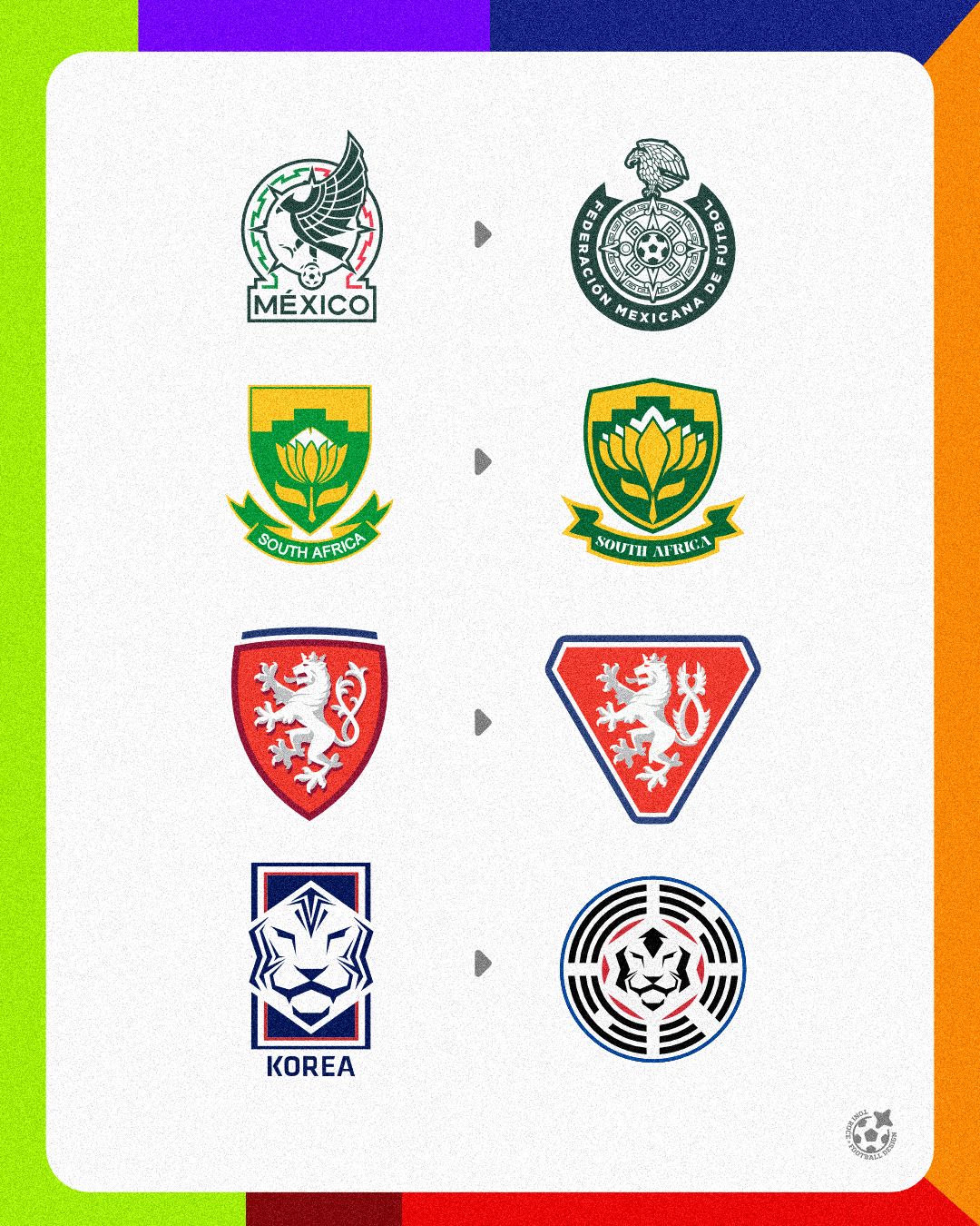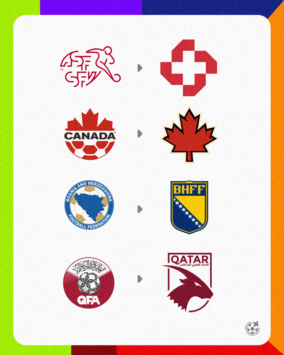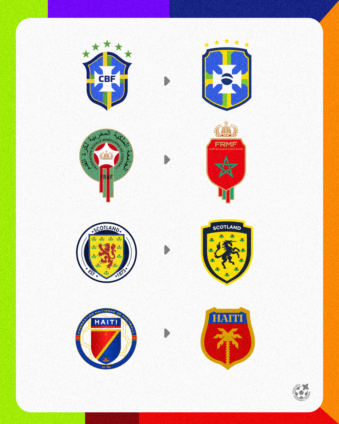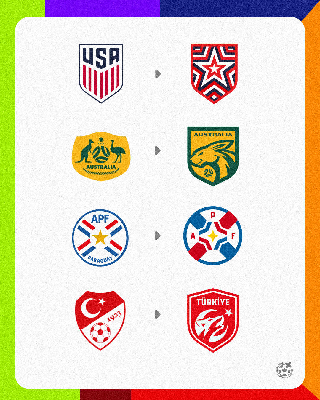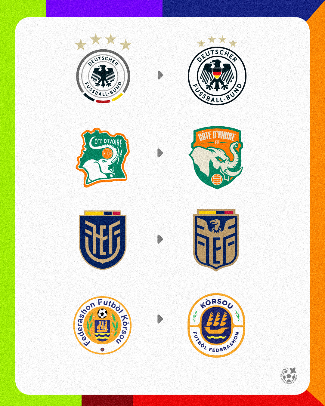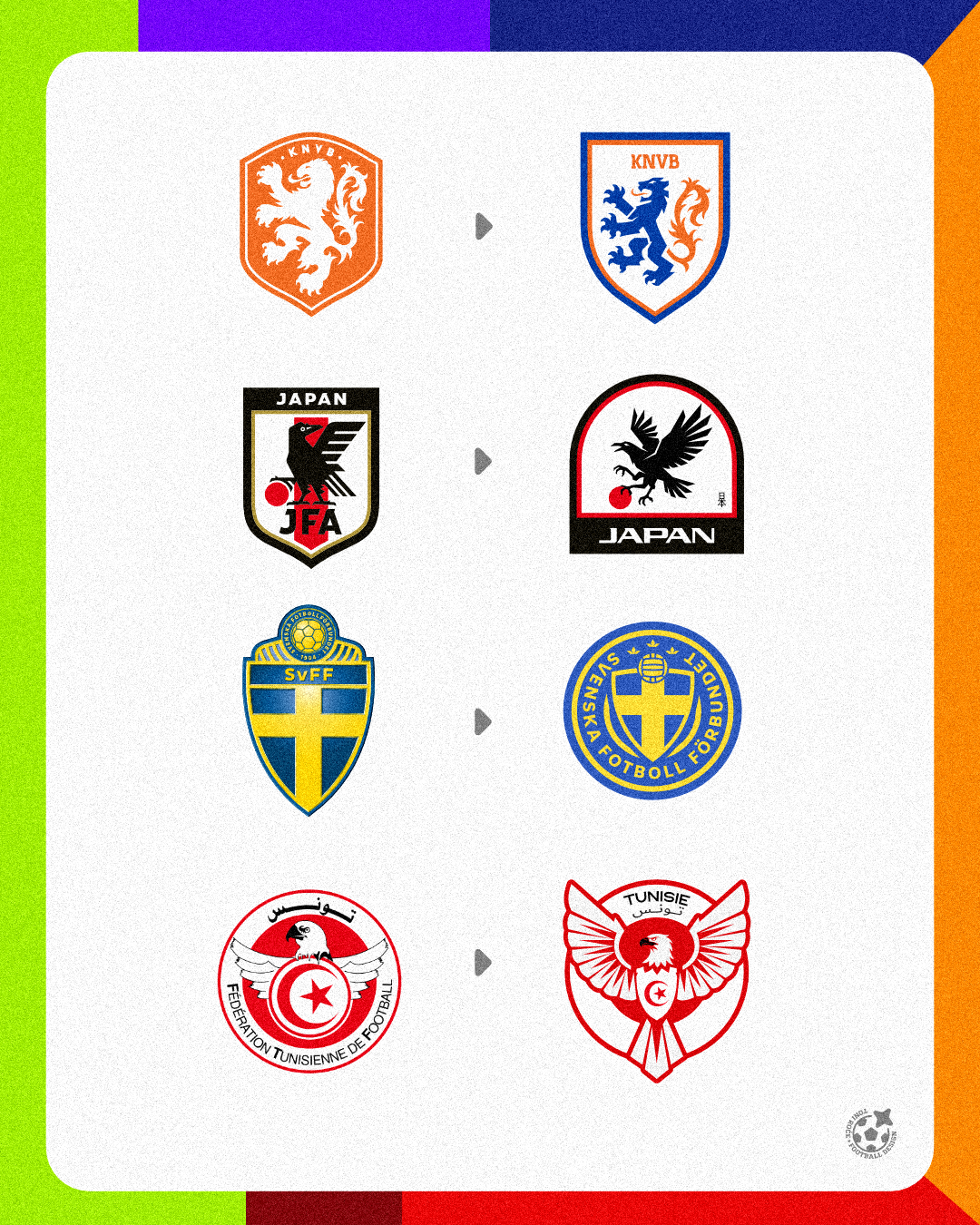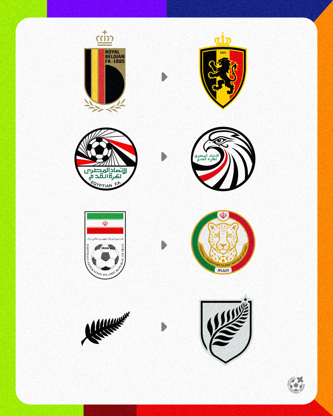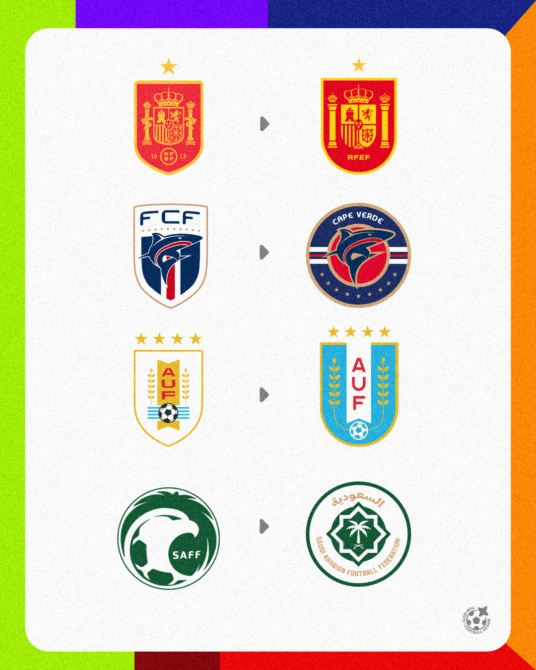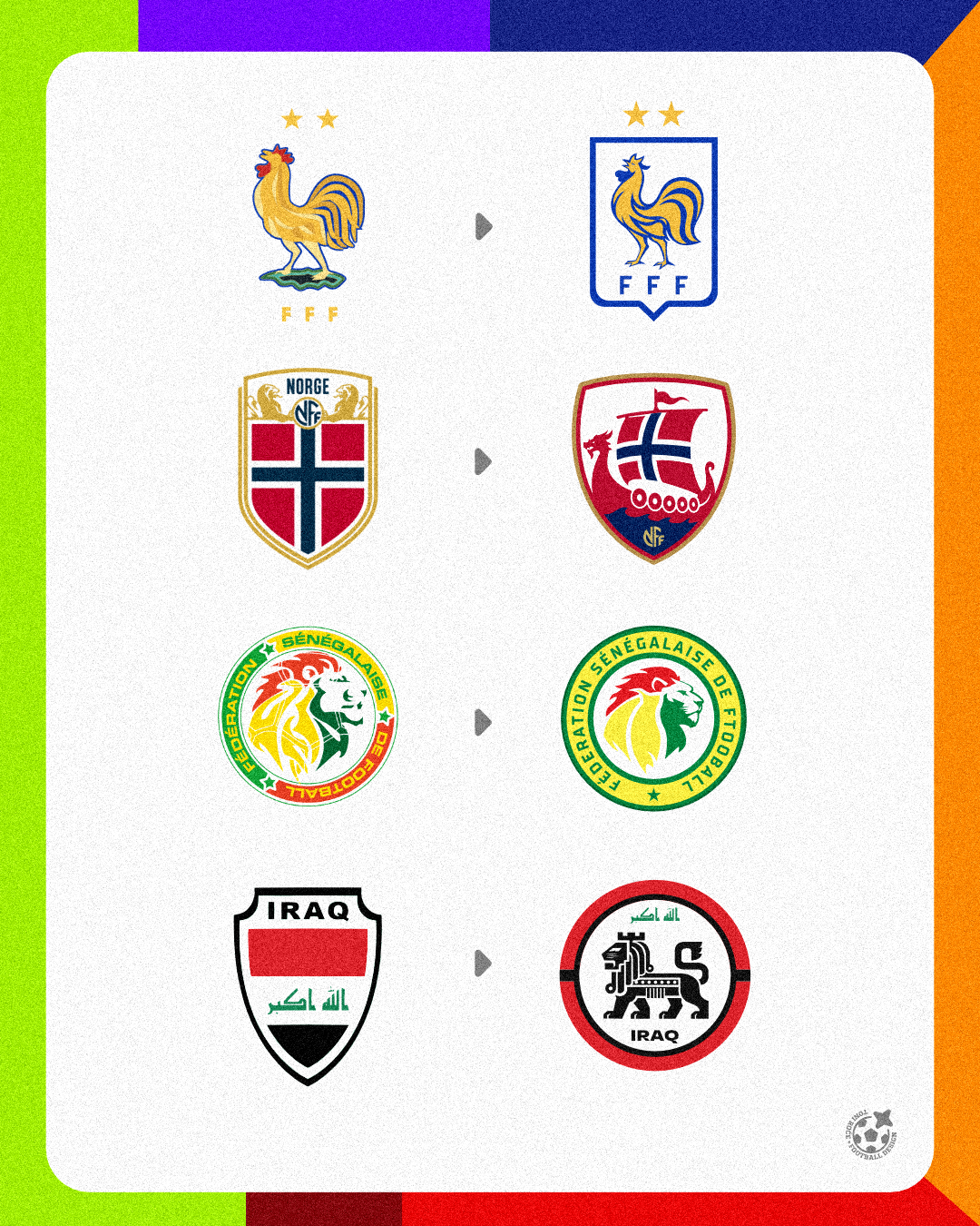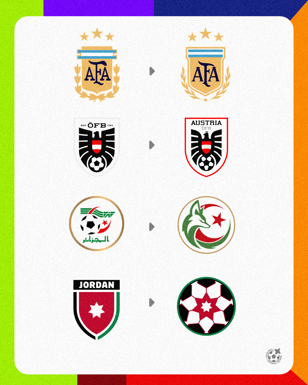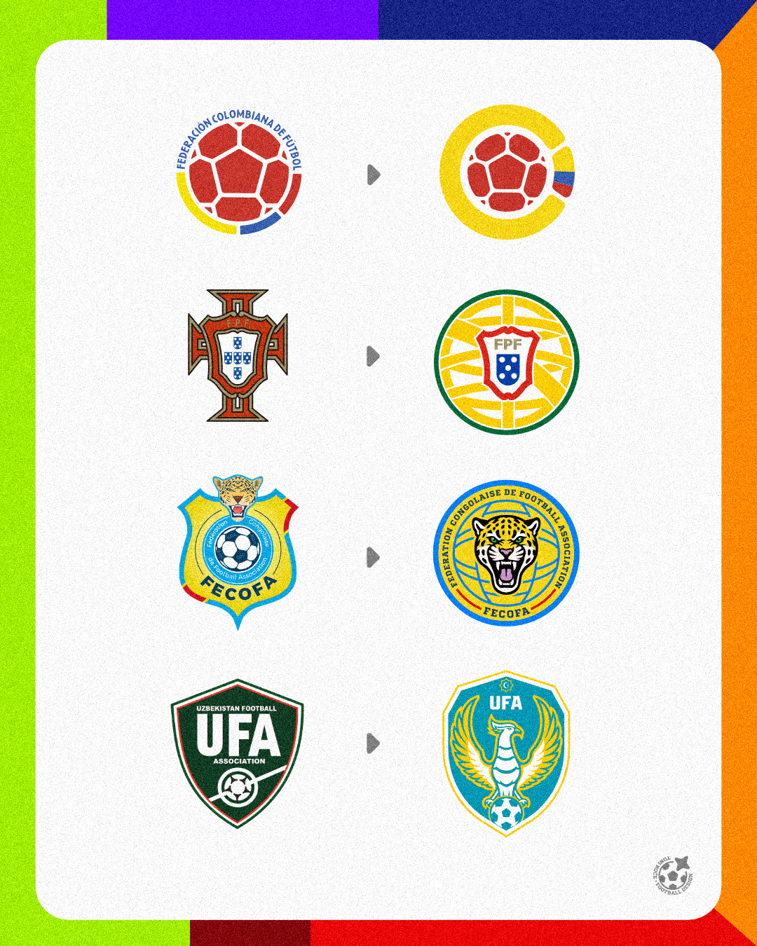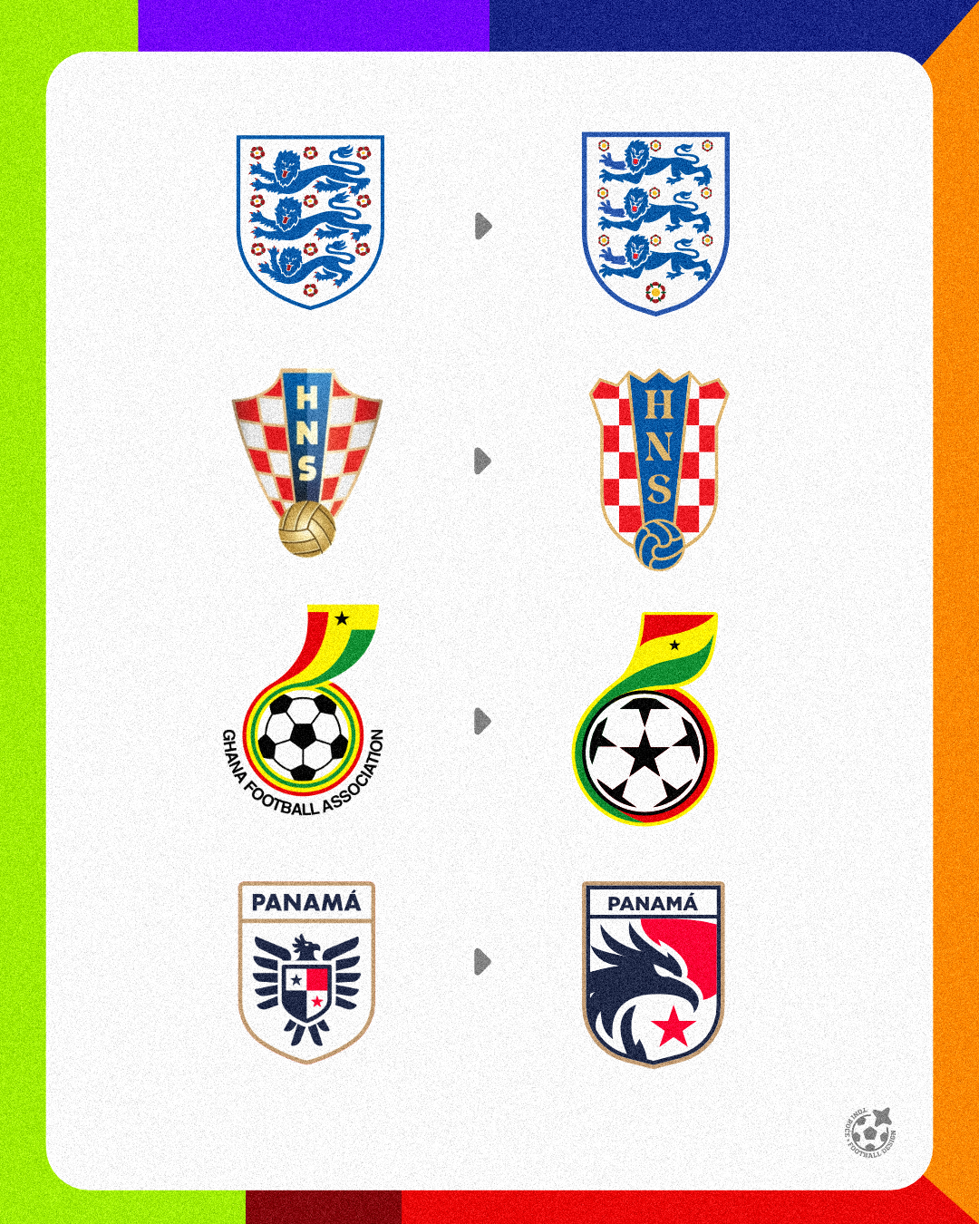

I Redesigned All 48 World Cup Nations. Here’s What Happened.
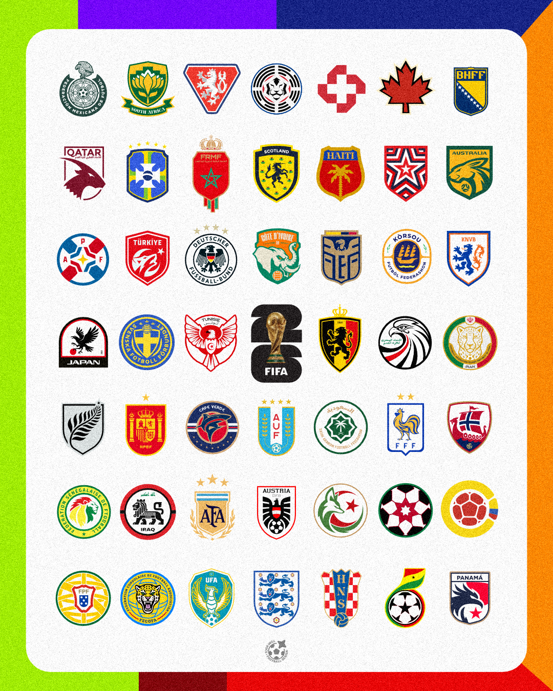
What a summer. I watched almost every World Cup game I could. Living on the other side of the world meant that sometimes this involved staying up ridiculously late, waking up at strange hours, or simply accepting that an all-nighter was happening. Was it worth it? Absolutely. But watching the tournament was only part of my World Cup experience. At some point, I gave myself a slightly ridiculous challenge: Redesign the identities of all 48 participating nations. Forty-eight teams. Forty-eight football cultures. Forty-eight different histories, symbols, colours, traditions, and fanbases. Some of the final designs became pieces I am genuinely proud of. Some were… okay. And a few probably deserve another visit. That was part of the fun.
- Klijent
- Personal
- Usluge
- Brand Identity
Izazov
Redesigning one football badge is already difficult. Redesigning 48 of them is a completely different challenge. The goal was never simply to make every badge look cleaner or more modern. Football identities carry history. Supporters have emotional relationships with their national team badges, colours, animals, symbols, flags, typography, and even some of the strange details designers might normally want to remove. That meant every redesign came with the same question: How much can I change before the identity stops feeling like that country? I wanted each concept to feel modern and intentional while still being immediately connected to the nation it represented. And because I was designing so many identities, I also wanted to avoid falling into the trap of making 48 minimalist badges that all looked like they came from the same designer. Each country needed its own personality.
Rešenje
My approach was to treat every nation as its own small branding project. Before designing, I looked at the existing identity and tried to understand what actually made it recognizable. Sometimes that was an animal. Sometimes it was a national symbol. Sometimes it was a specific colour combination, monogram, shape, pattern, or historical reference. From there, I decided what needed to stay, what could be simplified, and what could be completely reconsidered. The objective was not modernization for the sake of modernization. It was about finding the strongest idea inside the existing identity and giving it a clearer visual voice. Some badges only needed refinement. Others gave me an opportunity to completely rethink the concept. And occasionally I took a bigger risk because I thought there was a more interesting story that could be told through the identity. Those were usually the designs that generated the strongest reactions. Not Every Redesign Was a Masterpiece I am not going to pretend I loved all 48 equally. Some designs came together almost immediately. Everything clicked: the concept, symbolism, proportions, typography, and overall character. Those are the ones where I looked at the final result and thought: Yep. That's the one. Others took multiple attempts. And there are definitely a few where, looking back now, I think: Meh. I can do better. But that became one of the most valuable parts of the project. When you create one logo, you can obsess over it indefinitely. When you commit to creating 48, you have to make decisions, finish the design, publish it, learn from the reaction, and move on to the next one. That repetition became an incredible design exercise. Then the Internet Had Its Say This was probably my favourite part. People had opinions. Lots of them. Some redesigns received an incredible amount of love. People understood the concept immediately and connected with what I was trying to do. Other designs… Well, apparently I committed crimes against football heritage. And I loved that too. Football identity is emotional. If somebody gets genuinely annoyed because you changed their national team's badge, it shows how much these symbols actually mean to people. Not every comment agreed with my decisions, but the conversations around the designs often became just as interesting as the designs themselves. People explained which elements mattered to them, which historical references they wanted preserved, what they thought should never be touched, and what they believed their federation desperately needed to change. That feedback became another layer of the project.
Rezultat
By the end of the tournament, I had created 48 national-team redesign concepts. But the real result was bigger than having 48 new logos in my portfolio. The project forced me to work repeatedly with symbolism, geometry, typography, negative space, cultural references, colour systems, visual hierarchy, and brand recognition. It also reminded me of something important: A successful football badge is not necessarily the prettiest badge. It needs character. It needs recognition. It needs meaning. And most importantly, it needs to feel like it belongs to the people wearing it. Sometimes that means simplifying. Sometimes it means preserving something slightly awkward because that awkward detail carries decades of history. And sometimes it means completely challenging what already exists. Would I Do It Again? Hellll no! Forty-eight redesigns were enough to completely fry my designer brain. By the end of it, I was definitely feeling the design burnout, so I think I will give myself a little break before attempting anything remotely similar again. Maybe I will recover in time for the next World Cup. You know… In four years. Until then, I am very happy just looking back at the chaos. Some concepts became masterpieces. Some were controversial. Some were just okay. But all 48 taught me something. And considering this whole thing started because I wanted to have a little fun while watching the World Cup, I could not have asked for a better summer. Now there is only one question left: Which redesign was your favourite… and which one should I probably never have touched?
“The biggest lesson from this project was that redesigning something people already love is very different from creating something new. A designer has to balance improvement with recognition. Change too little and there is no reason for the redesign to exist. Change too much and you risk removing the very thing that made the identity special. Finding that middle ground became the challenge behind almost every badge I created. And after 48 attempts, I definitely understand football identity differently than I did before this World Cup.”